
 Join our Telegram Channel
Hello Trailblazers,
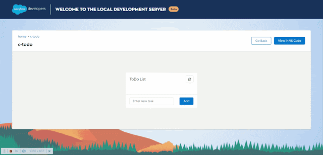
Welcome to the first tutorial in LWC Tutorial Series. We're focusing on the concept of Learning By Doing in this tutorial series and following that, it's time to get started with our first project in LWC which is a ToDo Application. In this tutorial, we'll be designing the markup in SLDS for our ToDo application and going forward in further tutorials, we'll be adding JavaScript in our application to make it working as shown below:-
So, let's start building the above application and while doing that, we're going to see from very basic, how we can built the HTML structure by looking at a design and we'll learn about various lightning tags and what's their usage on the go.
This tutorial is published on SFDC Stop YouTube Channel. So, if you want to learn in detail, have a look at the tutorial video down below. Otherwise, you can scroll down to have a look at the code gist with explanation where we created the markup of our ToDo Application
Tutorial Video
Code Gist with Explanation
I highly recommend you to have a look at the video to understand the thinking process like:- How I proceeded with creation of this component by just having a look at the design. However, I'll be explaining the code of the same below. So, let's have a look at the code using which we created our first ToDo App LWC component. My component name is todo and the code is given below:-
Happy Trailblazing..!!
HTML Snippet (todo.html)
As you can see in the above code, I have first of all created a lightning-card with a title ToDo List. I added a lightning-button-icon in the actions slot of the card with the icon of sync. I used slds icons to find out which icon I should use for this purpose. Next, I created the card body using lightning-layout and also created a paragraph which I added to the footer slot of the card.
Let's learn in detail about the card body first, inside the lightning-layout, I added a lightning-layout-item with padding as around-small in order to give equal padding from the border to all the list items and I specified the size to 12 as each row in lightning-layout can be divided into 12 columns at max, so, I wanted the card body to take/cover the maximum width available.
After that, I created an unordered list by referring to the slds code shown here and under each list item, I again created a lightning-layout as I wanted to divide the list item into two parts, one for the task name and other for the delete button which will be used to delete the task. This lightning-layout has a vertical-align property of center so that the text (task name) is aligned middle in vertical direction to look good with delete button and also, I specified a horizontal-align property to spread as I want the items in the task row i.e. the task name and delete button to spread evenly in the width available.
As specified above, each lightning-layout under the list item has two lightning-layout-item one for task name and one for delete button. I have given the padding as horizontal-small to both these lightning-layout-item so that they're properly spaced from each other and also from the corners. I again used lightning-button-icon in order to create delete button for each task.
Moving onto the footer code, I again used lightning-layout but this time I specified a property named as pull-to-boundary as small in order to make sure that the text field and the button that I am going to create should stick with their boundaries irrespective of the width. I created two lightning-layout-item inside that. Again, these two are having a padding of horizontal-small so that they're placed away from each other and from the footer corners as well.
In the first lightning-layout-item, I added the property of flexibility as grow because I want the input field to grow as the width increases, I didn't add this property to the second lightning-layout-item where I am going to place the button because I want the button to have a fixed width as it shouldn't grow depending on the container width.
Finally, I added a lightning-input field to the first layout item with a placeholder as Enter new task so that it's shown as a hint and I also specified the variant as label-hidden as I didn't want a label for this field. I also made this field required as it's important to add a task name before adding it to the todo list. For the second layout item, I just added a simple lightning-button with variant as brand as I wanted it to be blue in color. I specified the label of this button as Add, as this button will be used to add elements to the todo list.
The output of the above code i.e. the final design is shown below:-

That's all for this tutorial. I hope you liked it. All the code used in this tutorial is available on GitHub and you can have a look at that by clicking here. Make sure to have a look at the video if you want to learn in detail and let me know your feedback in the comments down below.Let's learn in detail about the card body first, inside the lightning-layout, I added a lightning-layout-item with padding as around-small in order to give equal padding from the border to all the list items and I specified the size to 12 as each row in lightning-layout can be divided into 12 columns at max, so, I wanted the card body to take/cover the maximum width available.
After that, I created an unordered list by referring to the slds code shown here and under each list item, I again created a lightning-layout as I wanted to divide the list item into two parts, one for the task name and other for the delete button which will be used to delete the task. This lightning-layout has a vertical-align property of center so that the text (task name) is aligned middle in vertical direction to look good with delete button and also, I specified a horizontal-align property to spread as I want the items in the task row i.e. the task name and delete button to spread evenly in the width available.
As specified above, each lightning-layout under the list item has two lightning-layout-item one for task name and one for delete button. I have given the padding as horizontal-small to both these lightning-layout-item so that they're properly spaced from each other and also from the corners. I again used lightning-button-icon in order to create delete button for each task.
Moving onto the footer code, I again used lightning-layout but this time I specified a property named as pull-to-boundary as small in order to make sure that the text field and the button that I am going to create should stick with their boundaries irrespective of the width. I created two lightning-layout-item inside that. Again, these two are having a padding of horizontal-small so that they're placed away from each other and from the footer corners as well.
In the first lightning-layout-item, I added the property of flexibility as grow because I want the input field to grow as the width increases, I didn't add this property to the second lightning-layout-item where I am going to place the button because I want the button to have a fixed width as it shouldn't grow depending on the container width.
Finally, I added a lightning-input field to the first layout item with a placeholder as Enter new task so that it's shown as a hint and I also specified the variant as label-hidden as I didn't want a label for this field. I also made this field required as it's important to add a task name before adding it to the todo list. For the second layout item, I just added a simple lightning-button with variant as brand as I wanted it to be blue in color. I specified the label of this button as Add, as this button will be used to add elements to the todo list.
The output of the above code i.e. the final design is shown below:-

Happy Trailblazing..!!


 Posts
Posts


Amazing video Rahul! You are genius! You are a great motivator to keep learning!!!
ReplyDeletefor better understanding go ahead and watch the video first. Excellent work..
ReplyDeletevery helpful
ReplyDelete