
 Join our Telegram Channel
In this post we're going to learn about the new LightningModal component that can be extended by any lwc which you would like to use as a modal. Salesforce has provided 3 helper components to create a modal:
- lightning-modal-header
- lightning-modal-body
- lightning-modal-footer
Let's create a testModal component and try to use these 3 tags to see what we get as a result.
Creating a simple testModal LWC
testModal.js-meta.xml
I am specifying the meta file first of all so that we can focus on our html and js files throughout this tutorial. Our meta file is pretty simple as shown below:
<?xml version="1.0" encoding="UTF-8"?>
<LightningComponentBundle xmlns="http://soap.sforce.com/2006/04/metadata">
    <apiVersion>55.0</apiVersion>
    <isExposed>true</isExposed>
    <targets>
        <target>lightning__HomePage</target>
    </targets>
</LightningComponentBundle>
As you can see above, I've specified lightning__HomePage as a target so that we can embed this component in our homepage. This is NOT REALLY REQUIRED as we're going to use our component as a modal, but I'm just keeping this for now, so that we can see what the helper components render for us. I've also marked isExposed as true to make this component available in our app builder.
testModal.html
The simplest HTML content for our modal is shown below:
<template>
    <lightning-modal-header>Test Modal Header</lightning-modal-header>
    <lightning-modal-body>Test Modal Body</lightning-modal-body>
    <lightning-modal-footer>Test Modal Footer</lightning-modal-footer>
</template>
We've only called the header body and footer tags with some content in them. I embedded our component on the homepage. Let's see the output below:
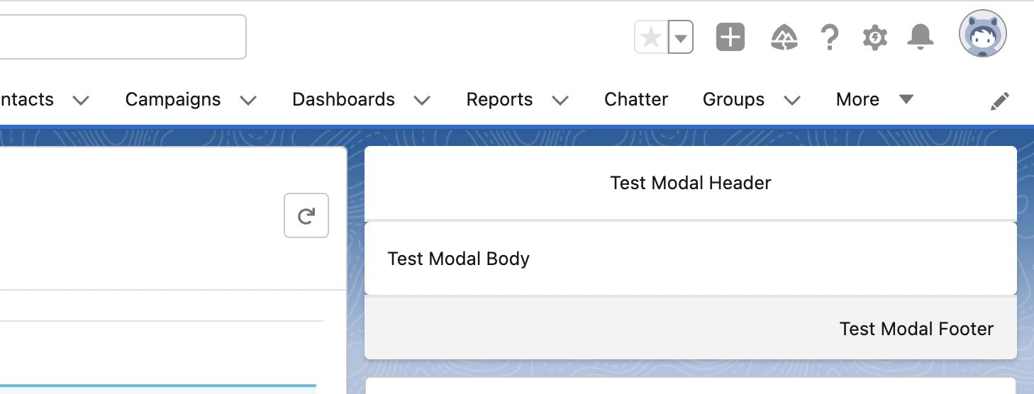
As you can see above, we're having 3 different sections: Header, Body and Footer coming from our lightning-modal-header, lighnting-modal-body and lightning-modal-footer tags.
It's better and easier to use label attribute of lightning-modal-header to specify the heading for our modal header. You can just update the lightning-modal-header tag as shown below:
<lightning-modal-header label="Test Modal Label">Test Modal Header</lightning-modal-header>
Let's see the output of this change as well:

You might not see any difference here but it'll be more clear as we'll start using this component as a modal.
Okay that's fine but how do I actually use this as a modal?
In order to open it as a modal, we'll create another lwc named: useModal but first of all let's update the js file of this testModal as well:
testModal.js
import LightningModal from 'lightning/modal';

export default class TestModal extends LightningModal {}
Notice the two changes I did above which makes it different from other LWCs:
- Instead of the statement, import { LightningElement } from 'lwc'; it's importing LightningModal from lightning/modal.
- Instead of extending LightningElement, our component is extending LightningModal using extends LightningModal.
That's all for our testModal for now, let's create our useModal component now:
useModal.js-meta.xml
Starting with the meta file, it's the exact same as we had above because we'll be embedding this component as well in our homepage:
<?xml version="1.0" encoding="UTF-8"?>
<LightningComponentBundle xmlns="http://soap.sforce.com/2006/04/metadata">
    <apiVersion>55.0</apiVersion>
    <isExposed>true</isExposed>
    <targets>
        <target>lightning__HomePage</target>
    </targets>
</LightningComponentBundle>Note: You can remove the lightning__HomePage target from your testModal now and remove it from the hompage, as we'll be using it as a modal now
Now, let's move on to the HTML part of useModal LWC:
useModal.html
<template>
    <lightning-card title="Use Modal">
        <p class="slds-var-p-horizontal_small">
            <lightning-button label="Open Modal" onclick={openModal}></lightning-button>
        </p>
    </lightning-card>
</template>
As you can see above, the code is pretty simple. We have a lightning-card (for better UI) and inside it, we have a paragraph which contains a lightning-button with label Open Modal. This button will call our js function openModal as it's clicked by the user. It's time to move on to our js file now!
useModal.js
For now, we'll just try to open our testModal:
import { LightningElement } from 'lwc';
import TestModal from 'c/testModal';

export default class UseModal extends LightningElement {

    openModal() {
        TestModal.open();
    }
}
As you can see above, we've imported our TestModal using the import statement and called open() on it in order to open our modal component. Let's see how it works!
This is how our useModal component looks like on the homepage:

I just embedded it before our testModal component. As we click on Open Modal button, we get the modal as shown below:

I hope that the usage of label attribute in lightning-modal-header component is clear now. You should use label attribute to specify a label for your modal. If you want to have any custom HTML like: a button or something else, that can come between our lightning-modal-header tags.
Isn't it amazing? just a few lines of code and you have your modal ready. The close button that you see on the top right works perfectly and your modal will be closed automatically as you click on that button.
Note: You can also close the modal by pressing the ESC key.
Resizing our modal
There are some properties that you can pass in the open function. One of the property is size which supports small, medium and large values. By default, the size is medium. You can pass any sizes out of small, medium or large. The output of all 3 are shown below.
To have a small sized modal, you can just do:
    TestModal.open({
        size: 'small'
    });
And you'll have the below output:

For a medim sized modal, you can just do nothing (as the default size is medium) or pass in the medium value as shown below:
    TestModal.open({
        size: 'medium'
    });
And you'll have the below output:

Similarly, for a large modal, you can just do:
    TestModal.open({
        size: 'large'
    });
And you'll have the below output:

Defining a Custom Close Button for our Lightning Modal
A very common requirement is to have two buttons: Cancel and Save in our modal footer. If someone clicks on Cancel, we'll just close the modal and if someone clicks on Save, we'll save the information and then close our modal. Let's see how we can implement that. It's time to update our testModal.html
<template>
    <lightning-modal-header>Test Modal Header</lightning-modal-header>
    <lightning-modal-body>Test Modal Body</lightning-modal-body>
    <lightning-modal-footer>
        <lightning-button label="Cancel" onclick={closeModal} class="slds-var-p-right_x-small"></lightning-button>
        <lightning-button label="Save" variant="brand" onclick={save}></lightning-button>
    </lightning-modal-footer>
</template>
As you can see above, I've removed the Test Modal Footer text which was present in between lightning-modal-footer tags and I added two lightning buttons instead: one for cancel and another for save. The Cancel button is calling closeModal() from our js and have an extra small right padding so that the two buttons don't stick to each other. The Save button is having a variant as brand and is calling save() from our js file. The updated testModal.js file is given below:
import LightningModal from 'lightning/modal';

export default class TestModal extends LightningModal {

    closeModal() {
        this.close();
    }

    save() {
        console.log('We will save the data and then close modal');
    }
}
You might have noticed above that I added two methods here:
- closeModal() which is calling close() here as this.close(). This close() is defined in the LightningModal component which we're extending and it'll close the modal.
- save() which is doing nothing as of now but adding a statement to the console that: We'll save the data and then close modal.
The updated modal is shown below:

As you can see, we have two buttons now: Cancel and Save. As you click on Cancel button, the modal will be closed. If you click on Save button, there will be a message in console but the modal will not close.
Let's say the user clicks on save and then while the information is being saved, the user clicks on Close button at the top right and the modal is closed, how do you ensure that the information was saved successfully? In this scenario, preventing the user from accidentally closing the modal is important, let's see how we can do that!
Prevent the user from closing Lightning Modal using disableClose attribute
For now, we'll consider a scenario that our save operation takes 5 seconds. So, we'll disable the Close operation for 5 seconds when the save button is clicked. We're not dealing with apex in this tutorial, so we'll just use setTimeout() to simulate our server call. Our testModal.js is updated as shown below:
import LightningModal from 'lightning/modal';

export default class TestModal extends LightningModal {

    closeModal() {
        this.close();
    }

    save() {
        console.log('We will save the data and then close modal');
        this.disableClose = true;
        const that = this;
        setTimeout(() => {
            console.log('Information saved! You can now close the modal');
            that.disableClose = false;
        }, 5000);
    }
}
Inside the save(), we're setting disableClose to true. Then we're calling setTimeout() (you can consider it similar to calling any apex method and waiting for the response). In setTimeout(), we can pass a function and specify the time (in milliseconds) after which that function will be called. Here, we've specified the time as 5000 milliseconds i.e. 5 seconds and after 5 seconds the function passed will be called. That function will print the text Information saved! You can now close the modal in the console and set disableClose to false again. This can be considered - as our save operation is successful and we want to allow the user to close the modal now.


For this, I am going to add disabled={disableClose} to both Save and Cancel buttons of my modal so that these buttons are disabled when disableClose is true. Below is the updated testModal.html:
<template>
    <lightning-modal-header label="Test Modal Label">Test Modal Header</lightning-modal-header>
    <lightning-modal-body>Test Modal Body</lightning-modal-body>
    <lightning-modal-footer>
        <lightning-button label="Cancel" onclick={closeModal} class="slds-var-p-right_x-small" disabled={disableClose}></lightning-button>
        <lightning-button label="Save" variant="brand" onclick={save} disabled={disableClose}></lightning-button>
    </lightning-modal-footer>
</template>
Notice the disabled attribute applied to both the buttons above. The updated output as I click on Save button of my modal is given below:

import LightningModal from 'lightning/modal';

export default class TestModal extends LightningModal {

    closeModal() {
        this.close();
    }

    save() {
        console.log('We will save the data and then close modal');
        this.disableClose = true;
        const that = this;
        setTimeout(() => {
            console.log('Information saved! Closing the modal...');
            that.disableClose = false;
            that.close();
        }, 5000);
    }
}
Notice that we called close() after we set disableClose to false in our save(). Now, the modal will close automatically after 5 seconds as we click on the save button.
So that's how you can create modals using the new LightningModal component. I hope you have a good idea of how it works and you can go ahead and create your own modals now. Some of the information that we didn't cover here are:
- Custom styling of modal's header, footer and body
- Passing information to modal while opening the modal (Just create an @api attribute in your testModal and provide value to it in the TestModal.open() like we did for size attribute)
- Passing information back to component that called the modal when the modal is closed (You can pass the value inside close() as a parameter and have a then() linked to TestModal.open() which will receive the return value as: TestModal.open({...params}).then((valuePassedToCloseFunction) => {})
- Firing an event from modal and capturing it in parent.
You can refer to the official documentation or comment below and let me know if you would like to learn about these in detail and I'll create another post. You can also find my contact details on Connections (username: rahulmalhotra)
So that's all for this tutorial. I hoped you liked it, let me know your feedback in the comments down below.
Happy Trailblazing!!


 Posts
Posts


No comments:
Post a Comment